SL1 Design System · ScienceLogic · Design systems
A shared design language, built while the product was being built.
Six development teams were building ScienceLogic's Behavioral Correlation release, and there was no shared component library or visual language to hold it together. I built the design system alongside the feature, so the release would look and work like one product.
6 teams, 1 library
The first time the teams building the release worked from shared components.
17 component pages
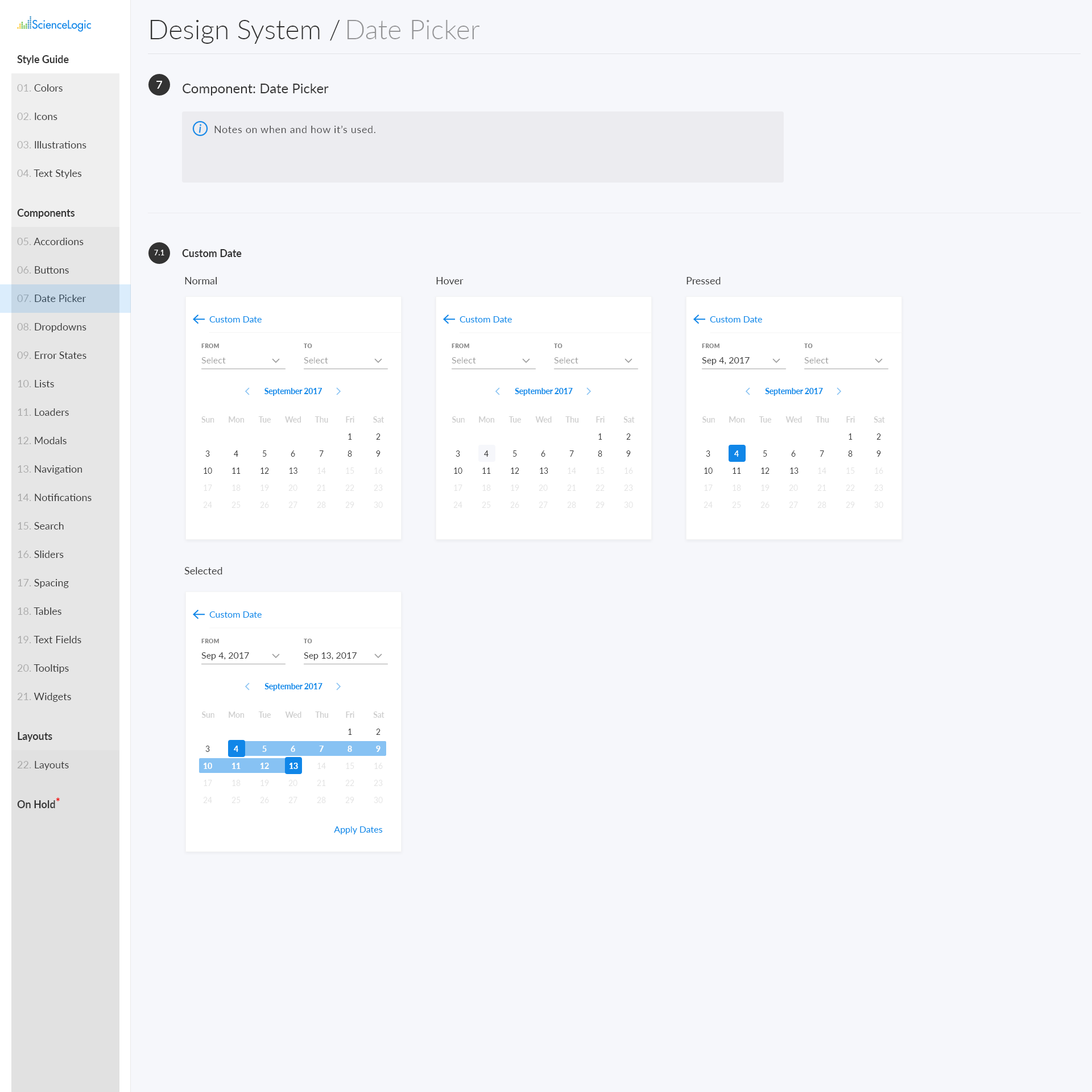
From buttons and tables to date pickers and tooltips, each with its states documented.
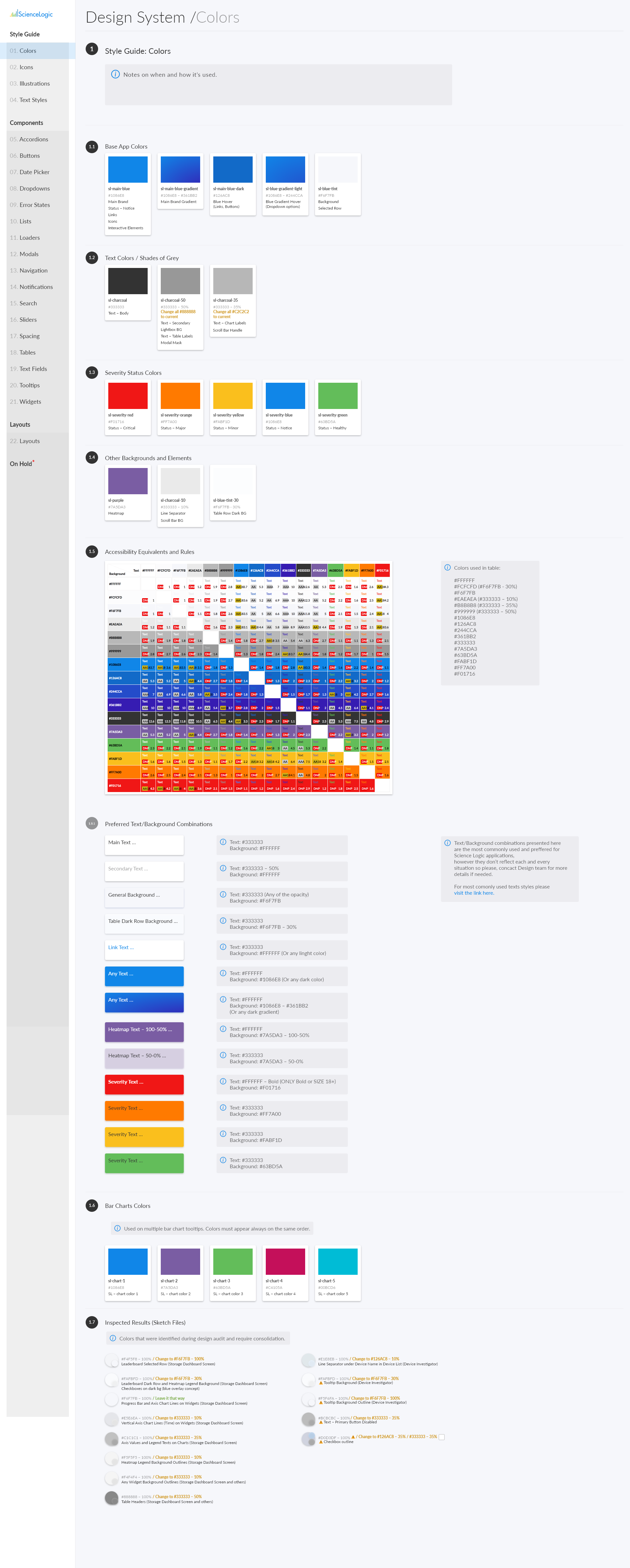
Every color pair rated
A contrast table showing which text and background combinations pass accessibility standards.
01 · The problem
Six teams, no shared language, and a major release coming.
ScienceLogic's SL1 platform had grown across several product teams without a shared design system. Each team had its own way of building common pieces. Behavioral Correlation was going to put all of that work on screen at once, and the differences would be impossible to miss.
The system couldn't wait until after the release. It was what would make the release feel like one product. That meant building it at the same time as the feature, not ahead of it.
Most design systems are built from scratch or cleaned up afterward. This one was built while the product it had to unify was being built around it.
02 · The approach
Scope it to the release. Build it to last.
The first decision was what not to build. A full audit of the whole platform would have taken longer than the release timeline. I focused the system on what Behavioral Correlation needed and set up the patterns future components would follow.
The foundations came first: named colors, type styles, and spacing. Each color has a name and a job, like the five severity colors from critical to healthy. Components built from those foundations match each other automatically, so a team can't drift off by making a one-off choice.
03 · Key decisions
Three choices that kept the scope small and the system scalable.
Scope
I built only what the release needed, in a way that could grow.
Building just what Behavioral Correlation required kept the system achievable on the release timeline. I set up the structure so later components would fit into it, not sit beside it.
Foundations first
I defined colors, type, and spacing before any components.
With the foundations in place first, consistency was built into every component. It's much harder to drift from a shared color or spacing value than to ignore a style guide.
Every state
I documented every state, so engineers didn't have to guess.
With six teams building at once, most inconsistency would come from gaps in the documentation. Each component shows how it looks and behaves in every state, with notes on when to use it. The components were also built in Storybook, so engineers worked from a live, working version of what was designed, not just static pictures.
04 · What I took from this
What building under a release deadline taught me about systems.
A system that ships with the product beats a perfect one that comes later.
A design system's value is in what it makes possible, and it can only do that while the product is being built.
Foundations before components.
Consistency built into the structure holds up better than consistency written in guidelines. I took the same approach years later when I rebuilt Tidal Cyber's design system from tokens up.
A working reference beats a picture.
Engineers who could see a component working in Storybook had far less to interpret than those working from static files.
Accessibility is easier to keep when it's written down.
Rating every color pair once saved every team from checking contrast on their own.