Landing Page Design System · Dell Technologies · Design systems
A design system that let marketers publish without IT.
Dell's global marketing teams couldn't change much more than a headline on a landing page without filing an IT request. I designed the system that changed that: reusable page building blocks, built into Dell's content system, that let non-technical authors publish on-brand, accessible pages on their own across Dell brands and markets.
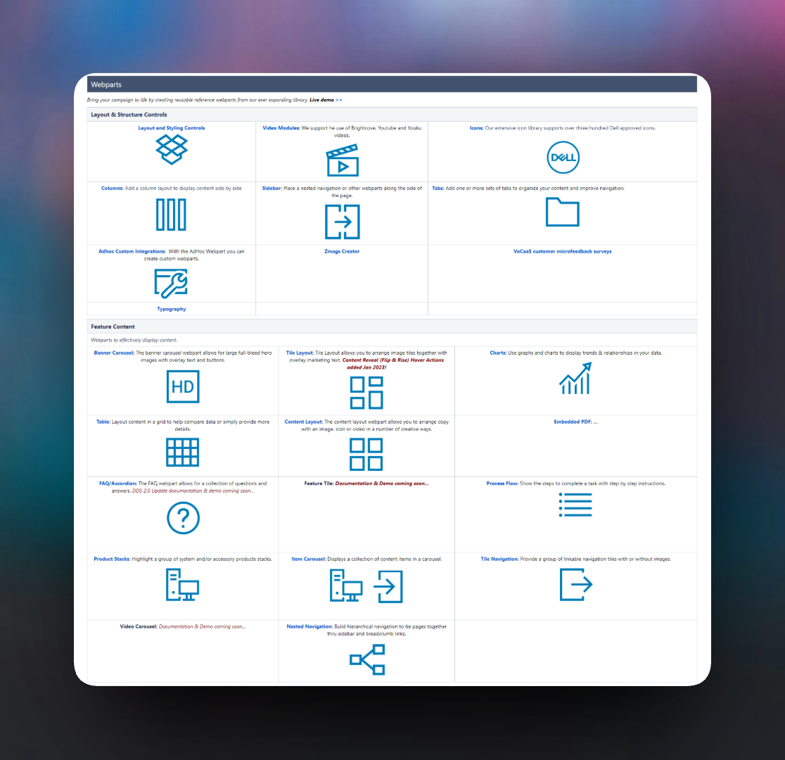
6,000+ pages
Landing pages across Dell's global marketing organization run on the system.
100% WCAG 2.1 AA
Every component meets the standard as built, so pages made with them do too.
No IT ticket
Marketing authors build and publish pages on their own.
01 · The problem
Marketing teams filed IT tickets to update a headline.
Dell's marketing teams built landing pages in AEM, and almost anything beyond a basic text edit needed IT. Pages were slow to ship, looked different from market to market, and depended on engineering time that was always overbooked.
The goal was a system that gave marketing authors real independence: pages that were on-brand, accessible, and consistent, built without IT. It had to work for very different people, from regional marketing coordinators to developers building custom pages.
If authors couldn't use it with confidence, nothing else about the system mattered.
That made the author experience as important as the components. One system had to serve multiple Dell brands, markets around the world, four kinds of authors, and thousands of existing pages.
02 · The approach
Start with the author, not the component.
Before designing a single component, I mapped the four kinds of authors: what each was trying to do, how comfortable they were with technical tools, and where the current setup got in their way. The components followed from those needs.
The system was built in layers. Shared styles feed components, components combine into page templates, and authors assemble pages from those templates. Consistency comes from the structure, so nobody has to police it.
Layer 1
Shared styles
Color, type, and spacing defined once for every brand.
Layer 2
Webparts
Reusable blocks like carousels, tiles, tabs, and FAQs, each accessible as built.
Layer 3
Templates
Webparts combined into page layouts that fit common campaign needs.
Layer 4 · Author
Publish a page
Authors assemble and publish pages themselves, no IT request needed.
03 · Key decisions
Three choices that let the system scale.
Usability bar
I designed for the least technical author first.
If the system worked for a regional marketing coordinator with no technical background, it worked for everyone. I used that person as my test for every decision, and it pushed several components somewhere a developer-first approach wouldn't have gone. Advanced settings stay out of the way until someone needs them.
Accessibility
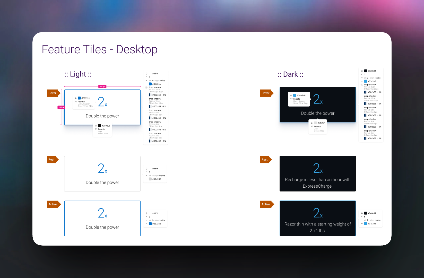
I built accessibility into every component instead of checking for it at the end.
WCAG 2.1 AA wasn't an audit at the finish line. It was part of each component's design, including every state and both light and dark versions. Authors couldn't accidentally publish an inaccessible page, even if they'd never heard of WCAG. That's the only kind of accessibility that holds up across thousands of pages.
Documentation
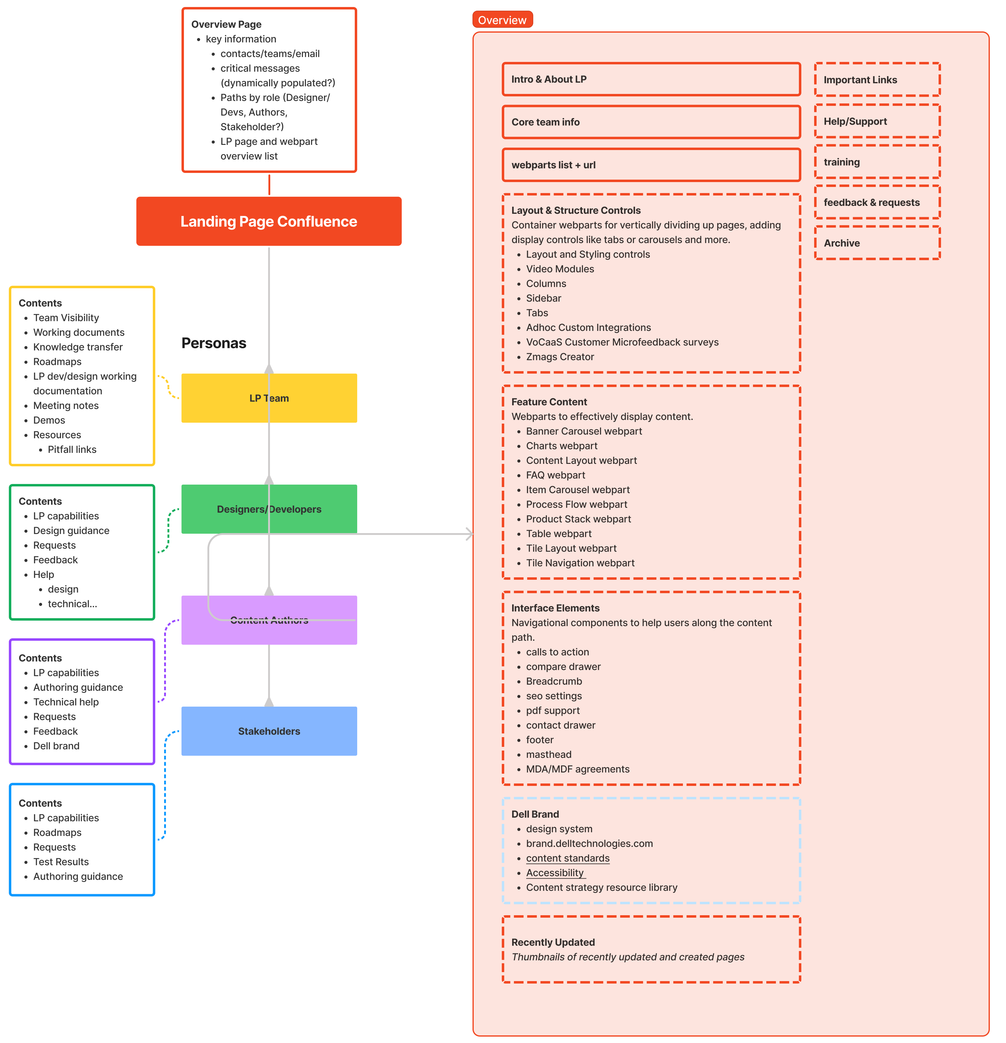
I wrote documentation for each audience, not one manual for everyone.
A single technical reference would have served developers and been ignored by everyone else. I planned the documentation around who was reading it, with a different starting point, vocabulary, and level of detail for each group.
04 · What I took from this
What designing for four kinds of users taught me about systems.
The author experience is the product.
A design system is only as good as the experience of using it. If people need help every time, it hasn't solved the problem it was built for.
Accessibility scales when it's built in.
Designing it into the components once pays off on every page the system produces, without a separate review each time.
Documentation is a design surface.
Writing for four audiences showed me how complex the system really was, as much as designing the components did. I carried that into the generated documentation on Tidal Cyber's design system.