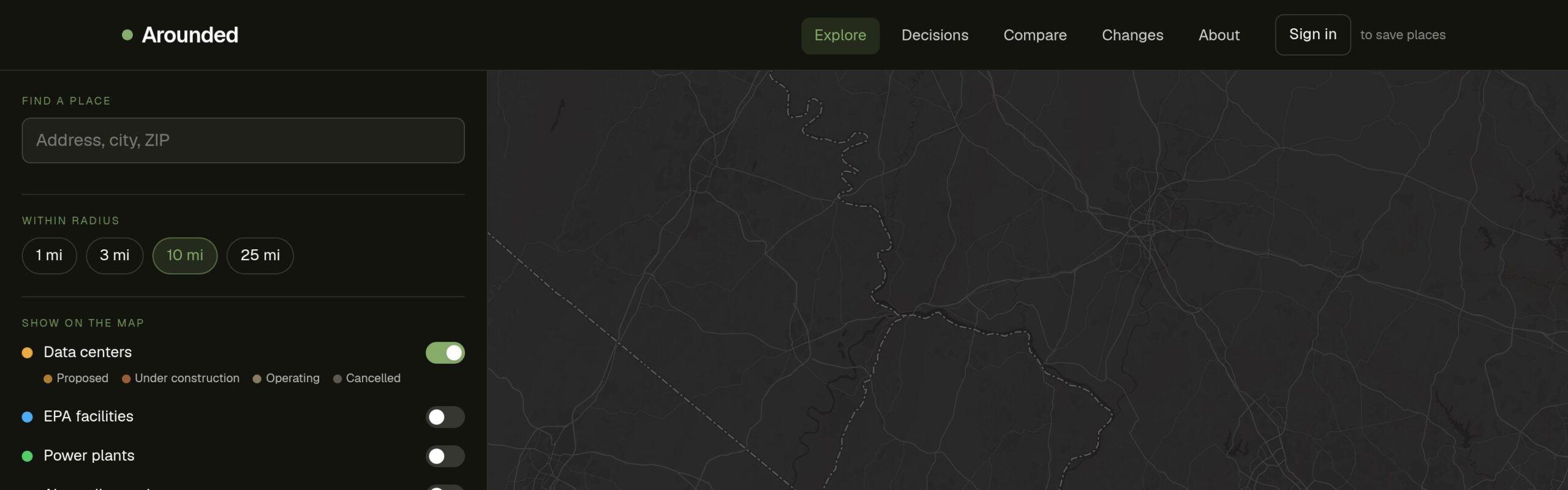
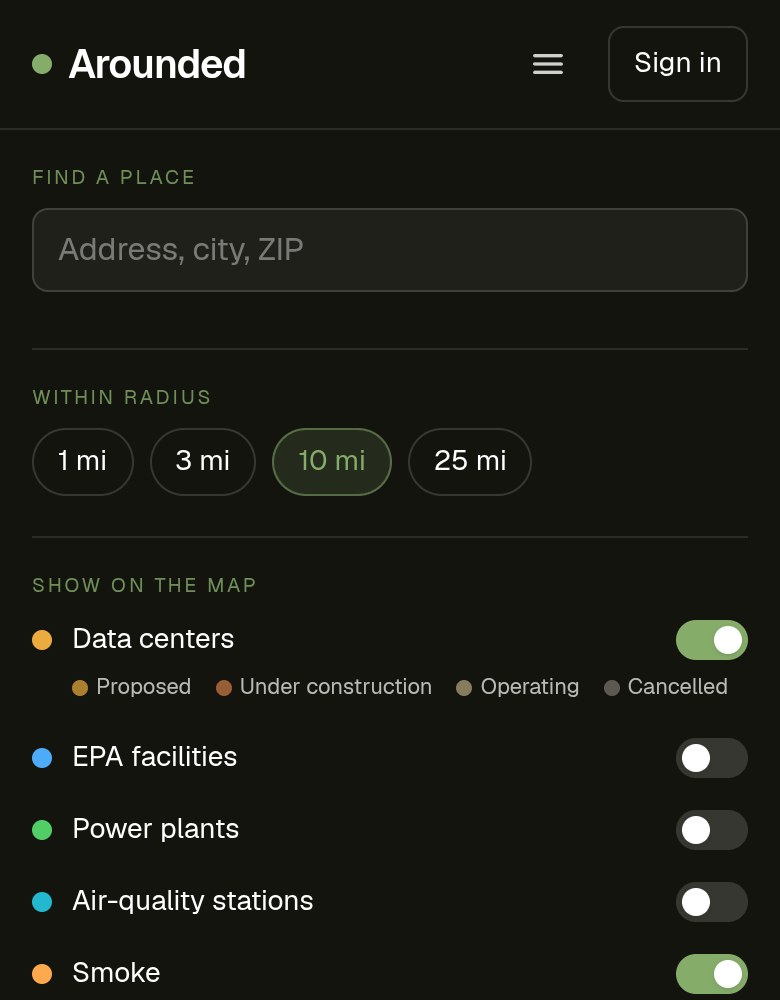
See what's moving in around you.
A free, transparent map of what surrounds the places you care about — data centers, industrial facilities, power plants, air quality, and wildfire smoke — and how it changes over time. Every layer names its source. No black boxes.
Live · arounded.kamalacreated.com/map

Public data, at human scale.
Data center construction has exploded near residential communities. Industrial facilities get permitted near neighborhoods. Wildfire smoke travels hundreds of miles. Air quality can shift from healthy to hazardous in hours. All of this information is publicly available — EPA, NOAA, FracTracker, Open-Meteo — but none of it is assembled in a way that answers what most people actually want to know: what's happening around where I live?
Arounded connects those sources, keeps them current, and puts them on a map you can actually use. No jargon, no regulatory framing, no "data as of Q4 2023" disclaimer. The map is live. The sources are named. You can go check them yourself.
"No black boxes. Every layer names its source, so you never have to take our word for it."
Announced, in permitting, or awaiting approval — the stage where input still matters
Approved or actively being built
Up and running today
Withdrawn or blocked
Five layers. Six sources.
Color-coded by status. Power demand and cooling where available. Refreshed weekly from FracTracker's public dataset.
NOAA satellite imagery, refreshed daily. Logged for saved places to build a "smoke day" history.
AQI and PM2.5 from Open-Meteo. Logged once daily — 90-day history so you can see trends, not just today's reading.
Regulated industrial facilities, pulled on demand for the area you're viewing. Always current from EPA's own registry.
Power generation sites with fuel type and capacity. Real-world AQI sensors alongside modeled values.
Decisions page — public design transparency.
Arounded now has a /decisions page — a public log of what's been changed in the product and why. This isn't a changelog. It's a record of design and product decisions: what trade-off was made, what the reasoning was, and what was prioritized over what. Building in public means being honest about the choices, not just the features.
Public log of product and design decisions — the reasoning behind what was built, changed, or left out.
arounded.kamalacreated.com/decisions →What's been updated in the app — data refreshes, layer changes, new features. Separate from decisions.
arounded.kamalacreated.com/changes →Full source documentation — where each layer's data comes from, how it's processed, and what the known limitations are.
arounded.kamalacreated.com/methodology →Anyone asking "what's around me?"
Wondering whether a data center or industrial project is coming near them. Can search their address, see what's proposed, and sign up for alerts.
Comparing neighborhoods or weighing a move. The Compare page shows two places side by side with a year of air quality and smoke history.
Tracking facilities with sources they can cite. Every data point links to its original source — no dead ends.
Keeping an eye on smoke, PM2.5, and pollution day to day. Saved places log conditions daily and surface patterns.
Next.js, six APIs, Claude Code.
Built with Claude Code and Cursor. The main technical challenge was stitching together six public APIs with different update schedules, different data formats, and different geographic coverage models — and making the result feel like one coherent map rather than six layers bolted together.
Architecture, API integration, feature dev
AI-assisted iteration throughout
App Router, SSR, edge functions
Base map tiles and layer rendering
NOAA · EPA · FracTracker · Open-Meteo · OSM · OpenAQ
Auth · saved places · history logging
See what's around your place.
Free to browse, no account needed. Search your address, turn on the layers that matter to you. Sign in to save places and get alerts when a data center is proposed nearby.