ScienceLogic Design System —
consistency at platform scale.
Six development teams were building a major release. There was no shared component library, no unified visual language, and no time for a comprehensive audit. I built the design system that made the Behavioral Correlation release feel like one product — in parallel with the feature, not after it.
The Problem
Six teams. No shared language. The company's biggest release incoming.
ScienceLogic's SL1 platform had grown across multiple product teams without a unified design system. Each team had developed its own component patterns. Behavioral Correlation was going to put all of them on screen at the same time — and the inconsistency would be impossible to miss.
The design system wasn't a future investment that could wait until after the release. It was a requirement for making the release coherent. The constraint was real: it had to be built in parallel with the feature, not ahead of it.
How I Approached It
Scope to what the release needs. Build it to last.
The first decision was what not to build. A comprehensive system audit across the entire SL1 platform would have taken longer than the release timeline. I scoped the system to the components Behavioral Correlation actually required and established the architectural patterns that future components would follow.
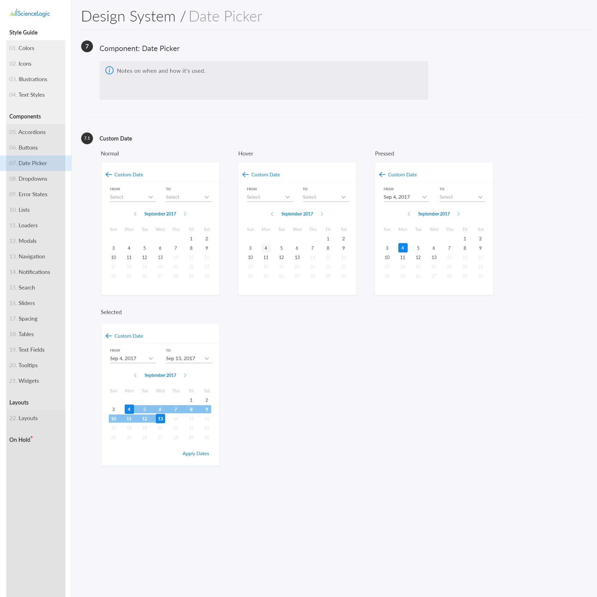
Spacing, color, and typography architecture with usage examples. Every spacing value, color, and typography decision documented as tokens. Any component built from these tokens is visually coherent with any other — by construction.
Tokens came first. Establishing the token system before building any components meant that consistency was structural — it couldn't be accidentally violated by a team making a local decision. Storybook gave engineers a working reference that matched what was designed.
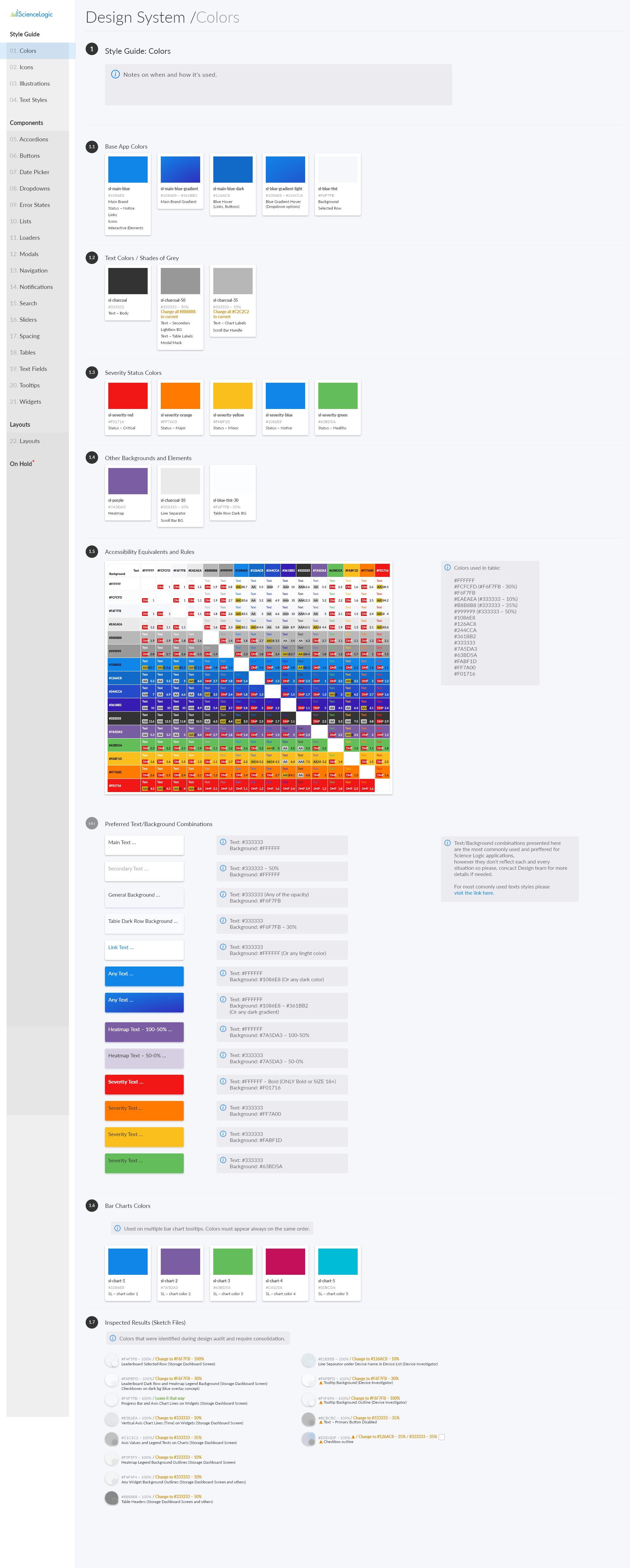
Components built from tokens, assembled into patterns. Updating a token updates every component that uses it — no manual propagation.
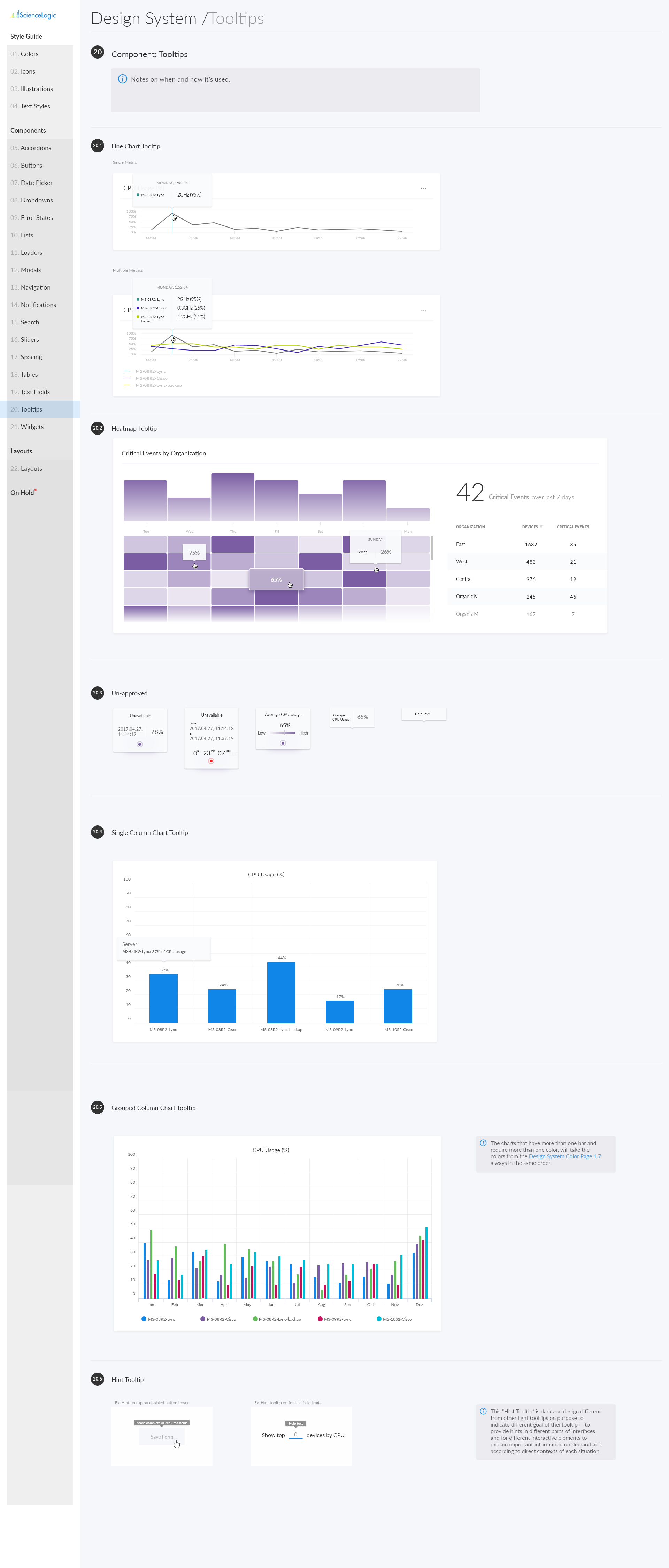
Storybook as the engineering handoff layer. Each component shows every state and variant in context — reducing interpretation errors.
Key Decisions
Three decisions that made the system achieve scope and still scale.
What I Took From This
What building under a release deadline taught me about systems work.
A system shipped alongside the product is worth more than a comprehensive system that comes after. The value of a design system is in what it enables — and it can only enable things while the product is being built.
Tokens before components. Structural consistency is more reliable than documented consistency. You can't guarantee teams follow guidelines — but you can make it architecturally difficult to deviate from tokens.
Storybook changes the handoff conversation. Engineers who can see a working component reference make far fewer interpretation errors than those working from static files.