What's New / Unified Landing · Tidal Cyber · Confidential
Helping security teams see what changed and what to do about it.
Practitioners and leadership were looking at the same data and getting very different things from it, or nothing at all. I led the work to turn two separate landing surfaces into one starting point that explains what matters and what to do next.
Unanimous
Every customer team in validation, across motorsport, pharma, healthcare, and defense, preferred the new direction over the legacy dashboard.
One starting point
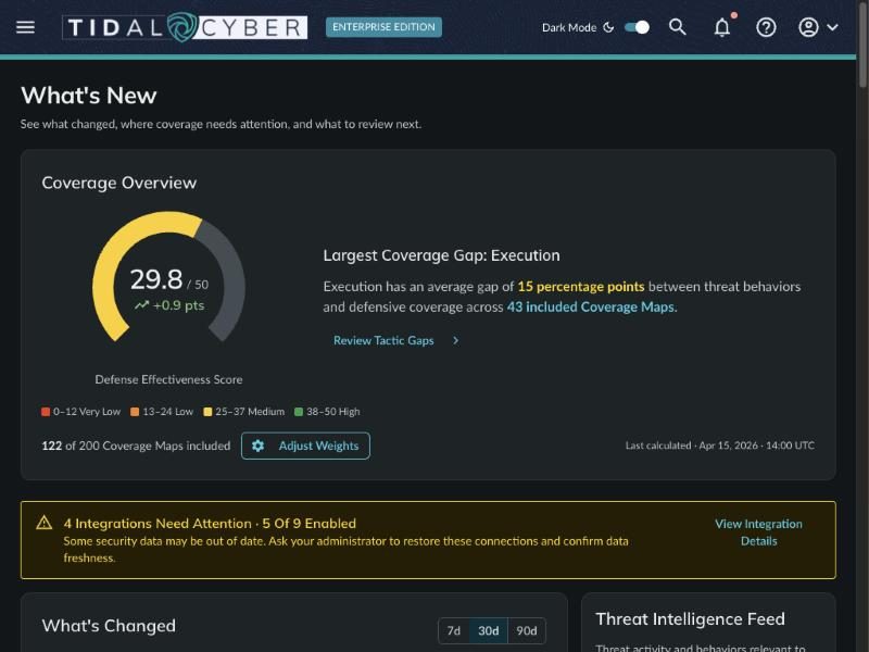
Coverage, threat intelligence, and recommendations in one place instead of two separate surfaces.
Shipped
The first release is live. The next one focuses on clearer context and better paths from findings to action.
01 · The problem
We had plenty of data. We weren't helping people understand it.
The original landing experience combined two areas: What's New, which surfaced threat intelligence and content updates, and Coverage Map Rollups, which summarized an organization's defensive coverage.
Both served a purpose, but together they exposed a bigger problem. We were showing information without enough context to make it useful. Security practitioners needed more detail to investigate threats, coverage gaps, and recommendations. Leadership needed a simpler way to understand security posture and report progress. Neither group could reliably get what they needed without someone interpreting it for them.
The rollup combined individual Coverage Maps into one aggregate score, but what that score meant wasn't clear. Users couldn't tell what drove it, why it mattered, or what to do to improve it. The burden of interpretation sat with the user.
The question stopped being what data we could show. It became: what matters to me, why does it matter to my organization, and what should I do next?
02 · My role
Leading the strategy, research, and design.
I led UX strategy, research, design, and prototyping for the unified landing experience, and co-led product alongside the PM. I worked with Product leadership, Engineering, and our Cyber Threat Intelligence team to line up customer needs with business priorities and technical limits.
That meant running customer feedback sessions, turning research into design decisions, building interactive prototypes, getting stakeholders aligned, and weighing in on implementation tradeoffs. Beyond the interface itself, I helped decide how the experience should explain complex information, serve different audiences, and connect people to the actions that matter.
03 · The design
From reporting information to supporting decisions.
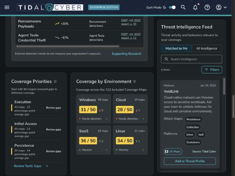
Instead of throwing out the existing rollup, I used it as the foundation. The goal wasn't to merge two pages. It was to help people understand their security posture, spot changes that matter, and act without digging across the platform to rebuild the context themselves. I focused on four areas:
Threat intelligence
Relevant intelligence, in context
Bring threat updates into the same view as the customer's coverage, explain why new intelligence matters, and link into existing workflows like Threat Profiles.
Coverage
A clearer coverage overview
Present security posture in a more approachable way, while keeping individual Coverage Maps one click away for deeper investigation.
Recommendations
Recommendations with context
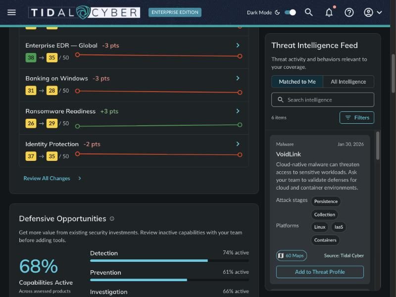
Connect each recommended action to the affected coverage, defensive tools, and underlying findings, so people can judge it instead of facing another list.
Change over time
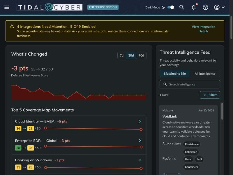
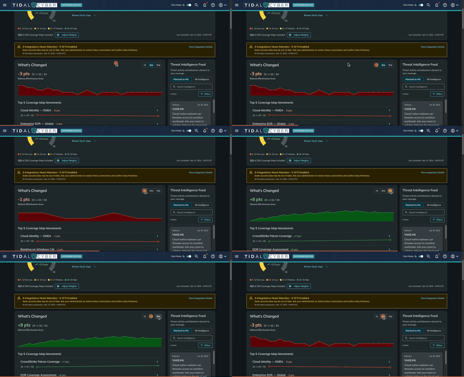
Trends, not just a score
Make coverage trends visible so people see how their posture is changing, instead of relying on one aggregate number or passive notifications.
04 · Validation
Four sectors, four different lessons.
Motorsport
Connecting intelligence with reporting
The team valued having threat intelligence and coverage in one view, especially for management reporting. That confirmed we needed to serve people who want the big picture without digging through operational detail.
Pharmaceuticals
Keeping detailed analysis front and center
This team cared more about individual Coverage Map analysis than the overall score. That challenged the idea that the aggregate should dominate, and it's why the summary became an entry point, not the whole story.
Healthcare
Validating one starting point
The team responded well to the consolidated direction, and pushed us to keep clear distinctions between types of information and the actions available for each.
Defense
From notifications to meaningful change
The team wanted to understand how coverage changed over time more than they wanted alerts that something changed. Evaluating a recommendation also meant more digging: which tools and maps it touched, how much effort it took, and whether it was worth it.
Knowing that something changed isn't the same as understanding what to do about it.
That feedback shaped the direction directly. I put more weight on coverage trends and the context behind each change, and less on notification badges.
05 · Outcome
A first release, and an honest scorecard.
We shipped the first phase of the unified landing experience: a new starting point for exploring threat intelligence, coverage, and the actions tied to them. Customer validation backed the overall direction and showed where relevance, clarity, and connections to existing workflows could get better.
We don't yet have quantitative evidence of better task performance or engagement, so I treat this release as a milestone, not a final measure of success. Since launch, I've kept working with Product and Engineering on feedback and priorities. The next release focuses on clearer threat intelligence context, better coverage explanations, and stronger paths from findings to action.
06 · What I took from this
Two things this project made concrete.
More information doesn't automatically create more understanding.
Early on, we focused on everything we could display. I learned to ask whether each piece actually helped someone make a decision.
Design doesn't stop at the first release.
Shipping gave us another chance to learn. Evaluating feedback, questioning assumptions, and refining the design has mattered as much as setting the original direction. Organizing information is the easy part. The real job is helping people see what matters and act on it.
07 · What I'd do differently
Not every user needs the same level of detail. If I did this again, I'd map those differences earlier and test how each role prefers to read, interpret, and act on information before committing to an information hierarchy.