Playground · Data Interpretation · Sense-Making Over Time

Arounded — understand what's around you.

A free environmental data map for tracking wildfire smoke, air quality, heat, and nearby facilities over time — without turning uncertainty into false certainty. Pattern over point-in-time. Sources visible, not hidden. Built on public data, free to use.

Type
Personal side project
Focus
Interpretive scaffolding · Data transparency
Sources
NOAA · Open-Meteo · EPA · Mapbox
Status
Live — free to use →
Map interface screenshot
Arounded map interface — wildfire smoke plumes, facility markers, layer toggles, and a location detail panel. Data sources are visible and linked throughout.
What it is

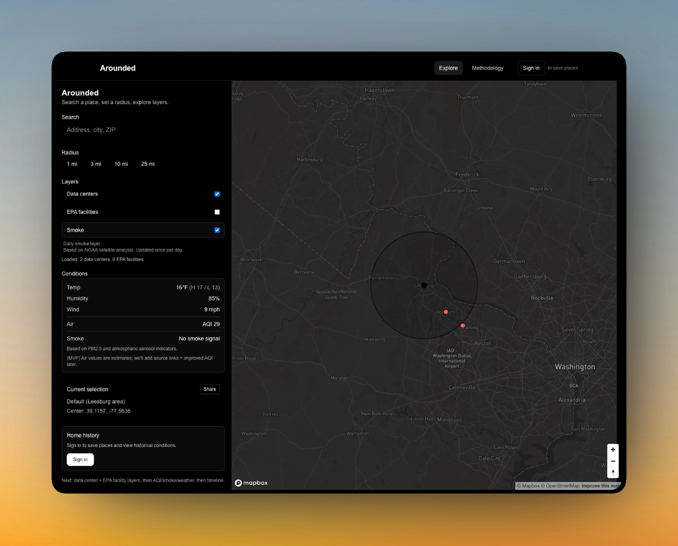
Pattern over point-in-time. Context over scores.

Arounded helps people see environmental context the way they actually need it: not just a single number right now, but what has been happening around the places they care about. Wildfire smoke patterns, air quality day to day, nearby facilities and infrastructure — shown as patterns, not alerts.

Most environmental data tools give you a single score right now. Arounded gives you a different kind of information: what has been happening, where that data comes from, and what the data can and can't tell you.

The design question at the center
How do you help people make sense of environmental uncertainty over time — without turning incomplete data into false confidence, or uncertainty into paralysis?
Smoke
NOAA HMS Smoke Product
Air quality
Open-Meteo Air Quality API
Facilities
EPA Facility Registry Service
Basemap
Mapbox
Design decisions
Sources are shown, not hidden
Every data layer links directly to its source. Users can verify what they're seeing and understand its limitations — smoke polygons are daily averages, not real-time measurements. Transparency is built into the interface, not buried in a methodology page.
No scores, no alarms, no 'danger' language
Environmental data is frequently misread when presented as a single score or alert level. Arounded presents the underlying signals and lets users interpret them in context. Pattern over panic.
History over 'right now'
The most useful environmental information isn't today's number — it's whether conditions are getting better or worse, and what normal looks like for a place. Saved-place history is the core feature.
Plain-language context at every layer
Every layer includes a plain-English explanation of what it shows, where the data comes from, and what it doesn't tell you. Interpretive scaffolding — giving users what they need to reason, not what they need to react.
Why this matters to my work

Arounded is the same design problem as Coverage Insight — how do you present complex, incomplete information to people who need to make real decisions, without giving them false confidence or overwhelming them with raw data? The domain is environmental signals instead of ATT&CK coverage, but the tension is identical.

Building Arounded gave me control over the full stack — UX, data sourcing, copy, methodology — to test data transparency patterns in a domain I understood end-to-end. Those patterns directly informed how I approached source visibility and honest uncertainty in my professional work.