Tidal Cyber · AI-Assisted UX · Case Study

NARC — Designing trust
into AI-assisted detection.

NARC used an LLM to extract intelligence from security procedures and surface findings analysts could act on. The design challenge was making those outputs trustworthy — not just useful — for analysts making real security decisions under pressure. Across three versions, every design decision was a trust decision.

Company
Tidal Cyber
My role
End-to-end UX lead · Sole designer
Scope
Access · Creation · Results · Rollout
Timeline
2023 – Q4 2025, ongoing into 2026
NARC v3 results view
The NARC v3 results surface. Each finding shows source attribution inline — visible without expanding metadata — so analysts can evaluate confidence before acting. Feature-flagged rollout kept enterprise adoption safe.
~30–40%
Fewer clarification asks about AI-generated content
0
Stale or misleading AI outputs shipped — by design
v3
Feature-flagged enterprise rollout — safe staged adoption
The problem

The AI worked. Getting analysts to trust it correctly was the harder problem.

Security analysts are skeptical by training. They've seen tools overpromise, produce false positives, and degrade into noise. An AI feature that surfaced findings without explaining itself — without showing its work — was going to get ignored or, worse, misused.

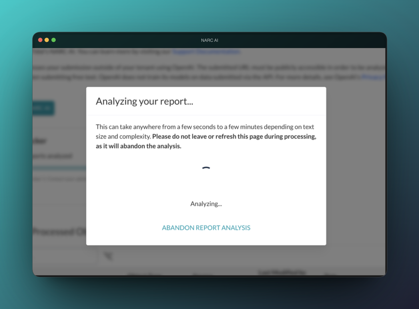
The design challenge wasn't just the happy path. It was every state in the workflow: what happens when a user doesn't have access? When the model is still processing? When results are partial? When the AI is confident but the analyst shouldn't be? Each of those states was a chance to either build or break trust — and none had been thought through.

The core tension
AI outputs needed to feel actionable — confident enough that analysts would actually use them — while being honest enough about their limitations that analysts wouldn't over-rely on them. Too much confidence in the UI creates the wrong kind of trust.
How I approached it

Map every state. Treat each one as a trust decision.

I mapped the full workflow from first contact to results — access, creation, processing, output, and the edge cases at each stage. For every state: What does the user need to know here? What could they misread? What happens if they act on wrong information?

State diagram
Workflow state map — access through results, with trust decision annotated at each stage
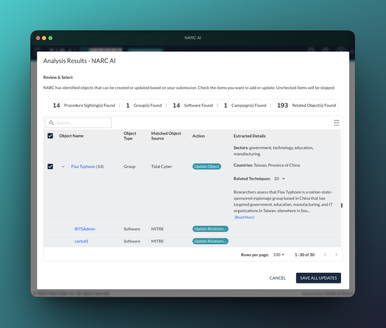
Every state annotated with what the user needs to know, what they might misread, and what the design does about it. This map drove every screen.

Access design turned out to be more important than I'd initially expected. Users with different permission levels needed to encounter the feature differently — but all needed to understand what they were and weren't seeing, and why. Getting this wrong would have meant users forming incorrect expectations about what the AI could do for them.

UI states
Access states — No-access, pending, and limited-access variants
Each state is honest about what the user can and can't see. No simulated previews, no implied capability that doesn't exist.
Results screenshot
Results view — Findings with inline provenance and source attribution
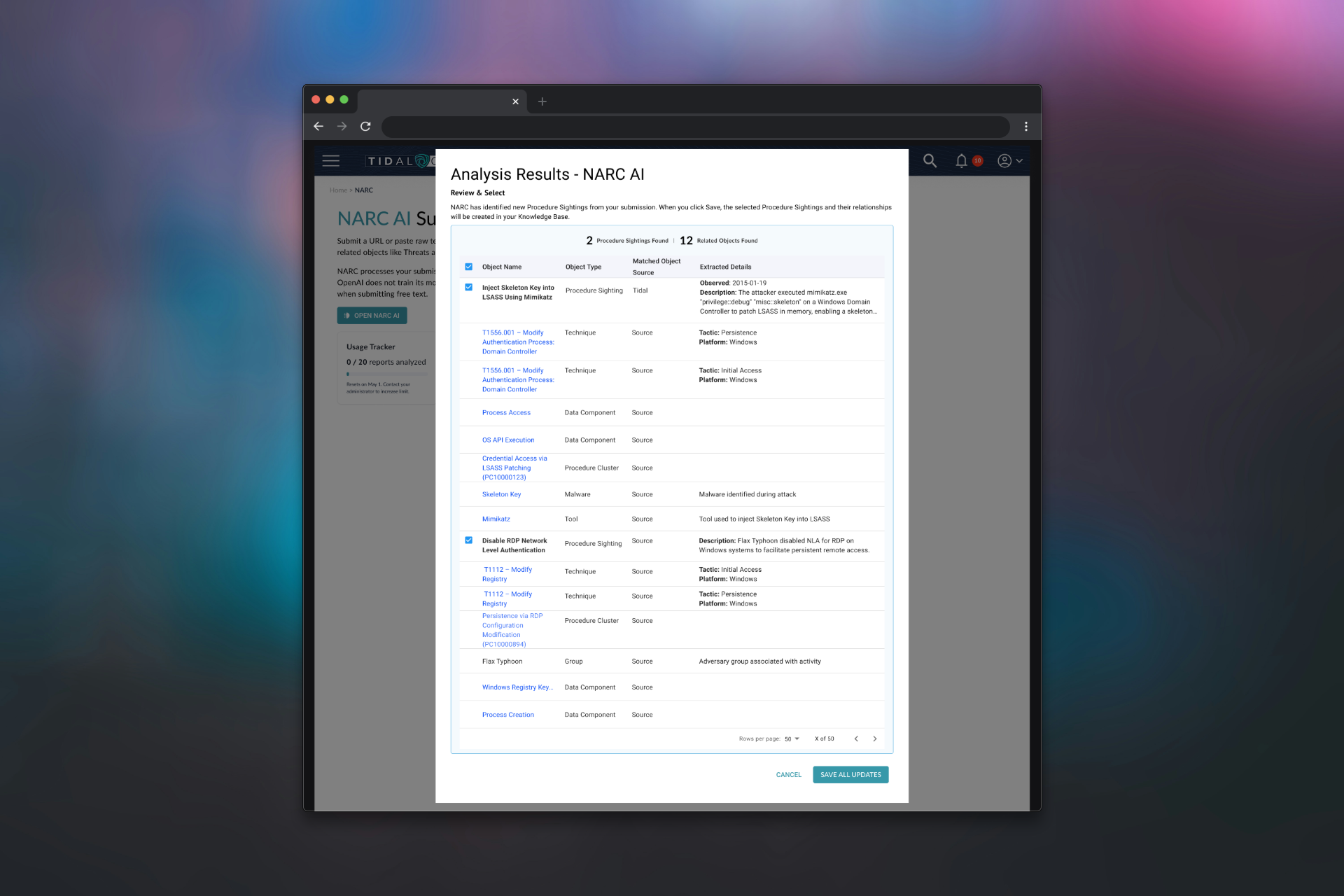
Source attribution visible in the primary results view, not hidden in a drawer. Analysts see the basis for each finding without an extra interaction.
Key decisions
No mock-run preview for users without access
A simulated preview was technically feasible and would have made the feature feel more tangible for users waiting on access. I rejected it — it would have fabricated results, giving users a false impression of what the AI would actually find in their data. The honest empty state took more craft but was the right answer.
Provenance visible in the results view, not buried in metadata
Analysts needed to know where a finding came from to decide how much weight to give it. Hiding that in an expandable panel would have meant most users never saw it. I surfaced it directly in the results hierarchy — visible by default, without overwhelming the primary findings.
Designed to actual system behavior, not the spec
Processing timing changed significantly as the model was tuned across versions. Rather than holding to the original spec while the system diverged from it, I updated the UI states iteratively to reflect what users actually experienced.
Feature-flagged rollout as a design input
The v3 rollout was feature-flagged — gradual, staged, with limited exposure before broad release. I designed the access experience to support this explicitly: users who didn't have access yet needed a clear explanation of what was coming and why, not a dead end.
What I took from this
AI trust is built state by state, not feature by feature. Every loading state, empty state, and error is a chance to earn or spend trust. You can't get the happy path right and ignore the rest.
Honest empty states are underrated. A blank screen that explains itself is more valuable than a populated screen that misleads. Users calibrate expectations early — and that calibration is hard to correct later.
Provenance is a feature, not a footnote. In high-stakes analytical workflows, knowing where a finding came from matters as much as the finding itself.
Designing for rollout stages changes the UX problem. When you know a feature is launching gradually, the access and onboarding experience becomes as important as the feature itself.